GOOGLE ADS MANAGEMENT
ALL SERVICES- GRAPHIC DESIGN & BRANDING
➥ WEBSITE DESIGN TORONTO
➥ TORONTO LOGO DESIGN
➥ BROCHURE GRAPHIC DESIGN
➥ INFOGRAPHIC DESIGN
➥ BUSINESS CARD DESIGN
➥ PACKAGE DESIGN TORONTO
➥ ILLUSTRATION DESIGN
➥ ADVERTISING POSTER DESIGN
➥ BRANDING STRATEGY & SERVICES- ➤ VIEW ALL SERVICES
WEB DEVELOPMENT & SUPPORT
➥ CUSTOM WEB DESIGN TORONTO
➥ ECOMMERCE WEBSITE DESIGN TORONTO
➥ WEBSITE MAINTENANCE SERVICES
➥ SHOPIFY WEBSITE DESIGN
➥ SHOPIFY EXPERTS TORONTO
➥ WORDPRESS DEVELOPMENT
➥ WORDPRESS MAINTENANCE- ➤ VIEW ALL SERVICES
WEBSITE MARKETING & CONTENT
➥ SEO PACKAGES TORONTO
➥ TORONTO SOCIAL MEDIA AGENCY
➥ CONTENT MARKETING TORONTO
➥ PPC MANAGEMENT TORONTO
➥ AFFILIATE MARKETING CANADA
➥ STRATEGIC CONSULTATION- ➤ VIEW ALL SERVICES
ABOUT
RESOURCES- LET’S CHAT
Questions? Call us at
647-348-4995
![]()
![]()
![]()

- December 16, 2019
-
Natalia Monsalve
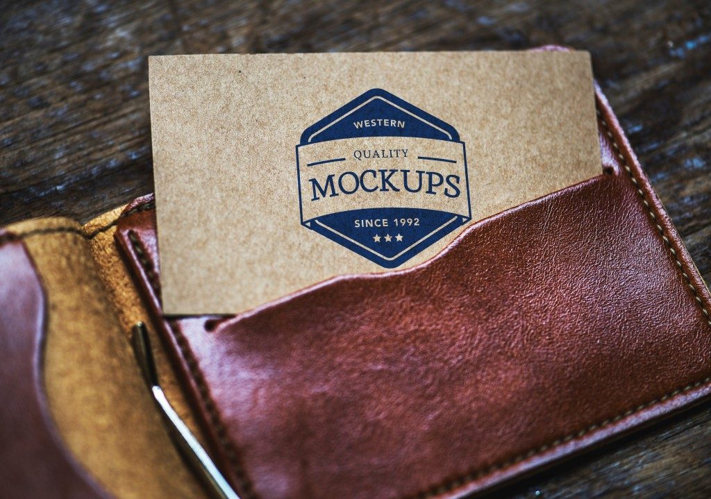
Even though today everything is becoming digital, there is still room for old school business cards. They have their own advantages that digital media still cannot cover. What would you do if you need to deliver your contact information to someone quickly because you’re in a hurry and there’s no time to use your cell phone? And what if there is no pencil or paper at hand? Or what if your acquaintance does not carry a cell phone at that particular moment? You lost a chance to network. Follow these tips from experts on the subject and make sure to create a business card that delivers a great first impression.
Invest In High-Quality Paper
As someone who works exclusively within the financial services industry, I’ve seen literally thousands of business cards and there’s only one quality that has made a few stand out from the rest… High-quality paper. I can’t stress this enough. Too many people try to make their business cards pretty and eye-catching, yet print it on low-quality paper. It takes away from the effect. I would rather have a simple business card on top-notch paper than an elegantly designed business card which feels like it was printed at home. Whenever people receive a business card on quality paper, they step back and take notice. I’ve even seen metal business cards and some wrapped in leather and velvet. These help you stand out and, in my experience, are worth the extra cost.
James Pollard, The Advisor Coach
Follow Design Trends
While your business card’s core purpose is to quickly communicate who and what you are to your audience, there are some great design trends that can help you stand out before you even say a word.
1) K-I-S-S… Keep It Super Simple – Make Marie Kondo proud. Don’t overcrowd your business card design in an attempt to make it pop. (It won’t bring joy to anyone, believe me.) Legibility and scannability are key to your success. Design elements should be purposeful and aid the communication of what you represent. You can still be quite creative within the minimalist trend through the strategic use of color, font choice and deliberate use of your brand’s logo. Don’t shy away from using both sides of the card. Allow one side to simply showcase your brand look and feel, while the reverse side introduces you and the solutions you offer.
2) Everybody’s got a type. What’s yours? – Big, bold and beautiful. The size, weight, style and color of a font can help to maneuver emphasis to the key areas you want to draw the recipient’s attention – to your name, company name, your services, or whatever is most important for you. Whether serif, sans-serif, simple or stylized, fonts can convey quite a bit about your business or personal brand. But don’t get too greedy. Too many typefaces in any one design become chaotic and difficult to read. In general, stick to three or fewer.
3) Be a heavy hitter – A little bit of heft can go a long way. Using a heavier cardstock for your business card can be a real statement-maker – representing your brand as premium and high-quality. It can help you stand out, quite literally, from a stack of competitors. A heavy cardstock causes the recipient of your card to pause with a deliberate moment of attention, feeling its weight in their hand.
4) Tickle the senses – Make them feel something…literally. Texture is a physical design element that can help to convey aspects of your brand identity without the need for copy or graphics. The literal and figurative touch helps your brand be more memorable. Natural textures, for example, are excellent for industries wanting to portray themselves as organic or natural.. A satin finish creates a tactile experience that conveys a bit more elegance and sophistication.
Tom Giannini, Global Creative Director, VistaPrint
Use Front And Back
There is no reason to leave one side of a business card as a blank. You need to be filled with great concern when designing your business card because it acts as a marketing tool and represents your business. The idea to leave the backside of the card without any expression is wastage of your paper cost as well.
You need to play smart when it comes to the creative design and layout of your business card. First, create a blueprint of card which should demonstrate your brand’s services and products. The back side can be used to imprint your brand’s message, or your customer’s review and feedback can cover it.
Aqsa Tabassam, Senior Growth Marketer, Brandnic
Understand The Restrictions And Capabilities Of Printing
The most important tip is understanding both the restrictions and capabilities of printing. You could have the nicest paper and printed on the best equipment, but if the designer doesn’t understand the limits of printing it will turn out horrible. Things that look good on a computer screen do not always translate well on paper.
Every printer will tell that the most important tip for great business cards is a correctly designed and setup file. If you are unsure of what is required, whoever you use as a printer will be glad to assist you.
I would say the next tip would be using printing capabilities to your advantage. A finish can take your business cards to the next level. This includes things like – Letterpress, Spot UV, Foil, Raised Spot or Foil. Paper type and weight also can play a role in great business cards.
Understanding the possibilities of how paper can be printed and finished is critical. If you ever have a question on how to set up a file or what kinds of business cards are available, most printers are more than happy to assist you. A lot of printers offer free samples if you just ask. Samples are a great way to get an idea of what a product feels and looks like.
Clark Waite, Owner, Tejas Print
RECENT POSTS
- Top 11 Canadian Business Bank Accounts (Comparing Fees & Reviews)
- PolicyMe – Legit Canadian Insurance Policy? Let’s Review…
- 10 Small Business Loans & Financing Options in Ontario
- Top 8 Small Business Insurance Providers in Canada (2025)
- SCAM ALERT: How a Fake Google Ads Inquiry Nearly Got Us (And How to Protect Yourself)

Ready to chat about how Little Dragon Media can enhance your business?
Call us now at 647-348-4995 or

OUR AWARDS & CERTIFICATIONS


WHAT OUR CLIENTS ARE SAYING


Little Dragon Media's professionalism and commitment to delivering excellence are truly commendable. I highly recommend their services... Thank you for your stellar work!
- Delna Bharucha

Little Dragon Media worked on developing our logo and website. They did an absolutely AMAZING job on both projects. These guys ROCK and you won't be disappointed.
- Sonia Nutt

My team had a great experience working with Little Dragon Media. We will certainly engage with Little Dragon Media for any additional projects in the future. Highly recommend!
- Carly Rooney


- 682A St-Clair West Toronto, ON M6C 1B1
- (647)-348-4995
- info@littledragon.ca
MOST POPULAR SERVICES
RECENT POSTS
GET MORE CLIENTS
Don't let your competitors take over. We'll help you climb to the top and get more clients.


- 682A St-Clair West Toronto, ON M6C1B1
- (647)-348-4995
- info@littledragon.ca
MOST POPULAR SERVICES
RECENT POSTS
GET MORE CLIENTS
Don't let your competitors take over. We'll help you climb to the top and get more clients.

Contact | Press Mentions | Privacy Policy | Terms of Service
© 2024 Little Dragon Media. All Rights Reserved.


