GOOGLE ADS MANAGEMENT
ALL SERVICES- GRAPHIC DESIGN & BRANDING
➥ WEBSITE DESIGN TORONTO
➥ TORONTO LOGO DESIGN
➥ BROCHURE GRAPHIC DESIGN
➥ INFOGRAPHIC DESIGN
➥ BUSINESS CARD DESIGN
➥ PACKAGE DESIGN TORONTO
➥ ILLUSTRATION DESIGN
➥ ADVERTISING POSTER DESIGN
➥ BRANDING STRATEGY & SERVICES- ➤ VIEW ALL SERVICES
WEB DEVELOPMENT & SUPPORT
➥ CUSTOM WEB DESIGN TORONTO
➥ ECOMMERCE WEBSITE DESIGN TORONTO
➥ WEBSITE MAINTENANCE SERVICES
➥ SHOPIFY WEBSITE DESIGN
➥ SHOPIFY EXPERTS TORONTO
➥ WORDPRESS DEVELOPMENT
➥ WORDPRESS MAINTENANCE- ➤ VIEW ALL SERVICES
WEBSITE MARKETING & CONTENT
➥ SEO PACKAGES TORONTO
➥ TORONTO SOCIAL MEDIA AGENCY
➥ CONTENT MARKETING TORONTO
➥ PPC MANAGEMENT TORONTO
➥ AFFILIATE MARKETING CANADA
➥ STRATEGIC CONSULTATION
➥ AI & LLMO SEO- ➤ VIEW ALL SERVICES
ABOUT
RESOURCES- LET’S CHAT
Questions? Call us at
647-348-4995
![]()
![]()
![]()
- May 19, 2025
-
 Jack Choros
A solid restaurant menu design in 2025 isn’t just a reflection of your restaurant’s brand and the atmosphere it creates, it’s an extension of all the marketing collateral that’s in the public’s view before they even get to your establishment. A properly designed menu can also increase profitability dramatically. The way people read things, the way they perceive value and the way they perceive the quality of the meals you’re offering are all influenced by the layout and design of the menu.
That’s why it’s vitally important to design your restaurant menu mindfully and develop a lasting, maximum impact in the mind of your customer. So with all of that being said, we give to you all of our top tips for designing a restaurant menu. We’ll even give you some examples of nice ones to get you inspired. But before you and your fellow restaurant owners tickle your fancy with design considerations, it’s important to understand your customer’s journey and why they’re coming to you in the first place.
Embrace QR Code and Digital Menus
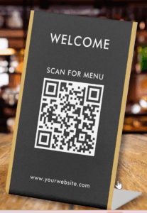
Image Source: Zazzle
QR code menus and mobile-optimized digital menus have become standard in many restaurants — not just for safety, but also for convenience and cost-saving.
These menus allow you to:
- Update dishes in real-time (no reprinting costs)
- Show different menus by time of day or table
- Add rich media (photos, icons, emojis, dietary tags)
- Collect data on which items are viewed most
They’re ideal for restaurants that want flexibility, data, and a modern brand experience. Tools like GloriaFood, Menufy, and Square offer built-in digital menu features.
Your Customer’s Journey to the Restaurant Menu
Your customer might be sitting in your restaurant ready to have lunch with the menu open and in front of them right now. But their journey to your dining table didn’t just come out of nowhere. The customer goes on a journey to get to your establishment well before they walk through your doors and grab a menu. It’s really important to know that. The design of your menu subconsciously reflects that you understand exactly what your target audience wants.
Answer a few questions about your target customer before you design your menu. You should really be answering these questions before you even open your restaurant. The questions should revolve around:
- Demographics
- Geography
- Psychographics
- Social structure
- Behaviours
Demographics
Knowing the demographics of your ideal diner is basic marketing 101. This includes knowing their age, gender, income, occupation and educational background. This stuff is pretty fundamental, so even if you have little to no marketing experience you’ve probably already thought about this on some level. It’d be pretty hard to even imagine opening up a restaurant without thinking about who it’s for. Still, you need to write this things down and know your demographics like the back of your hand.
Geographic Location
If you’re running a specialty restaurant or high-end steakhouse, the distance your customer is willing to travel is likely further than if you run a fast food joint. Either way, most restaurants will only be focused on the foot traffic travelling directly around your establishment. Knowing where your audience is located can help your marketing and advertising strategy. It can also assist you in understanding the kinds of content you may want to add to social media pages. Understanding the local geography can help your brand tremendously.
Psychographics
Understanding psychographics means knowing your customers likes, dislikes, hobbies and interests. The more you know about that, the better you can target both social media and pay-per-click advertising.
Social Structure
Understanding social structure is important for putting together a social media marketing strategy. It requires understanding the prospect’s family, friends and professional networks.
Behaviours
Behaviour can be anything from the websites a customer likes to browse, what they like to eat, what they spend their money on etc… Obviously those last two are of particular interest to a restaurant owner.
Designing the Restaurant Menu
So you’re aware of who your target customer is and you’ve got them through the door. They sit down and pick up the menu. Their goal is to find something good to eat that suits their taste buds, budget and dietary needs. Your goal is to profit as much as possible, make the experience of choosing a meal easy and make sure that every part of the dine-in experience is reflective of the branding and imaging you’re trying to create, because at the end of the day, you want to get people coming back again, and telling their friends about your restaurant. It’s time to go over the top tips.
Know Your Dishes
The number one task you need to take care of as you put together your menu is to know your dishes. This isn’t just about making sure that the chef knows what the ingredients of the different meals are, it’s more about doing something called “Costing the Menu”. Typically this involves putting your lowest-cost food items that produce the highest amount of profitability at the top of your menu. You also want to be aware of the volume at which these particular items are selling so that you know how to create consistency within your cash flow using your menu.
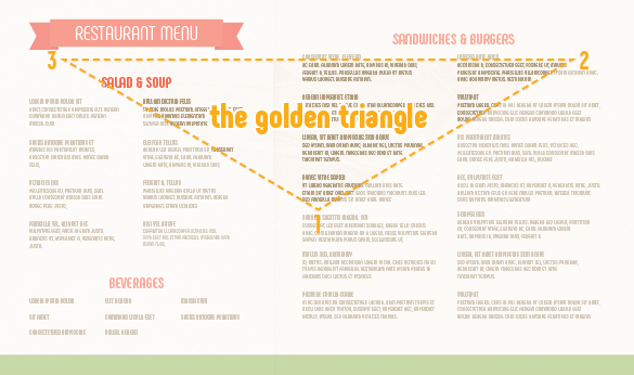
Understanding the Golden Triangle
Understanding the Golden Triangle is key to laying out the meals in your menu. The Golden Triangle represents the way people typically read a menu. Although everyone knows that people read from left to right in North America, that’s not actually where the eyes focus when a person opens a menu. Believe it or not, they actually look in the middle of the menu first. It’s a way of trying to encapsulate everything on the menu using peripheral vision. It’s a natural habit.
Customers will then look to the far right, where you should have your main meals, and then they will think about sharing an appetizer, which you will put to the left. In general you want all your meals with the highest margins in these three locations. Sometimes it’s recommended that the highest price items live at the top of every section. Doing this makes everything below the highest price items look more affordable. It’s a psychological trick that works!
Make Sure Your Menu Matches Your Marketing
This goes hand-in-hand with understanding your target customer. If you are running an upscale restaurant, you want your menu to have the look and feel of an upscale restaurant. If you’re running a small breakfast diner, you can get away with laminating the menu in your customers will be perfectly okay with that. You also have to make sure that the copywriting on the menu in the way things are laid out match the atmosphere you’re trying to capture as well. We’ll talk more about that in a second.
Use Photos Strategically (Especially for Digital Menus)
Photos are powerful — but less is still more when it comes to printed menus. One great image per page (or per section) can guide the eye and stimulate appetite. For digital or QR code menus, you can get away with more visuals, especially if your platform supports swipe-through galleries or interactive sections.
High-quality, mouth-watering food photos (not stock images) build trust and influence ordering decisions, especially among younger, mobile-first diners.
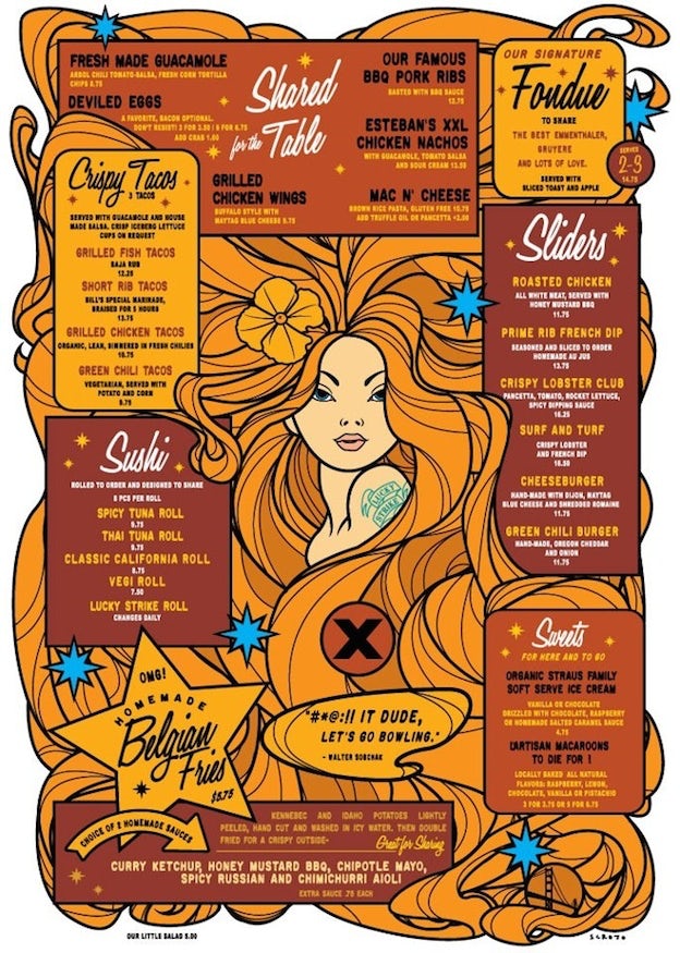
Consider Using Illustrations
Adding art to your menu gives it life. Assuming that doing so fits your brand and the atmosphere trying to create, giving people something visually stimulating to look at as they browse through your meal options can actually get them to spend more money because they’re more engaged with what they’re reading. It subconsciously relaxes the mind and makes people more likely to spend more money.
Avoid Using Currency Symbols
A peer reviewed study out of Cornell University suggests that dropping currency symbols from restaurant menus makes people spend more money.
The Cornell study still holds true today in 2025: removing currency symbols (e.g. $19 vs. 19) can increase customer spending by subtly reducing price sensitivity.
That said, if you’re using QR code menus, e-commerce-style online ordering, or delivery platforms, transparency and price clarity become more important — especially for compliance.
In print menus and in-house dining, feel free to skip the dollar sign. For digital platforms, test it and choose what aligns with your audience’s expectations.
Use Boxes to Outline Content
Boxes work! It helps the reader of the menu organize the content. It allows you to group everything into categories based on whether it’s an appetizer, main course or dessert. It’s also an opportunity to put the food items with the highest margins in the most attractive places and highlight those places. This is a tip you absolutely must implement. It works really well aesthetically in its stride, tested and true from a marketing perspective that it works.
Consider Typography
Depending on how you decide to use typography can actually be the most attractive element of your menu. Especially if you use bold headings with an interesting font choice. Be strategic with how much you use bold and italics. You want to engage the eyes as much as you can but you don’t want to make the menu too hard to read. It’s all about being tactful and keeping the reader’s experience in mind.
Choose a Good Colour Scheme
Choosing a good colour scheme means choosing colours that are on brand and engage the eyes. You don’t want to choose more than four or five colours because then the menu might be distracting and the customer won’t be focused on the items they’re trying to read. Choose your colours wisely.
Write Descriptive Copy
In order to get people walking through the doors of your restaurant, you’re going to have to invest in marketing and advertising. There’s no other way around it. The only exception is if you’re restaurant is located off of the freeway in a remote town where people don’t have any other choice but to come to you. Nevertheless, the copywriting doesn’t and when your customer is sitting in the restaurant. You need to create descriptions of meals that entice people to choose something with a higher margin. You need to offer deals on larger meals and offer promotions on slow nights that drive people to order chicken wings on a Wednesday night rather than having all of your customer show up on the weekend. Good copywriting can encompass all of these things in one menu and doing so is an absolute must.
Create Multiple Menus
Offering multiple menus throughout the year (lunch, dinner, seasonal, or rotating specials) keeps customers curious and coming back.
Thanks to QR codes, tablets, and digital menu boards, it’s now easier than ever to update or test different versions — even daily.
Some platforms let you A/B test dish descriptions, pricing, or photos to see what gets the most clicks or conversions. This gives you real-time insight into customer preferences and profitability.
To create all these different menus, the best thing you can do is hire a graphic design service to come up with new ideas for you.
There you have it! 17 different tips for the design of your restaurant menu that will help you establish a more profitable bottom line, keep customers engaged when they visit, and most importantly keep them coming back for more great meals and more of the wonderful ambience that your dining experience creates.
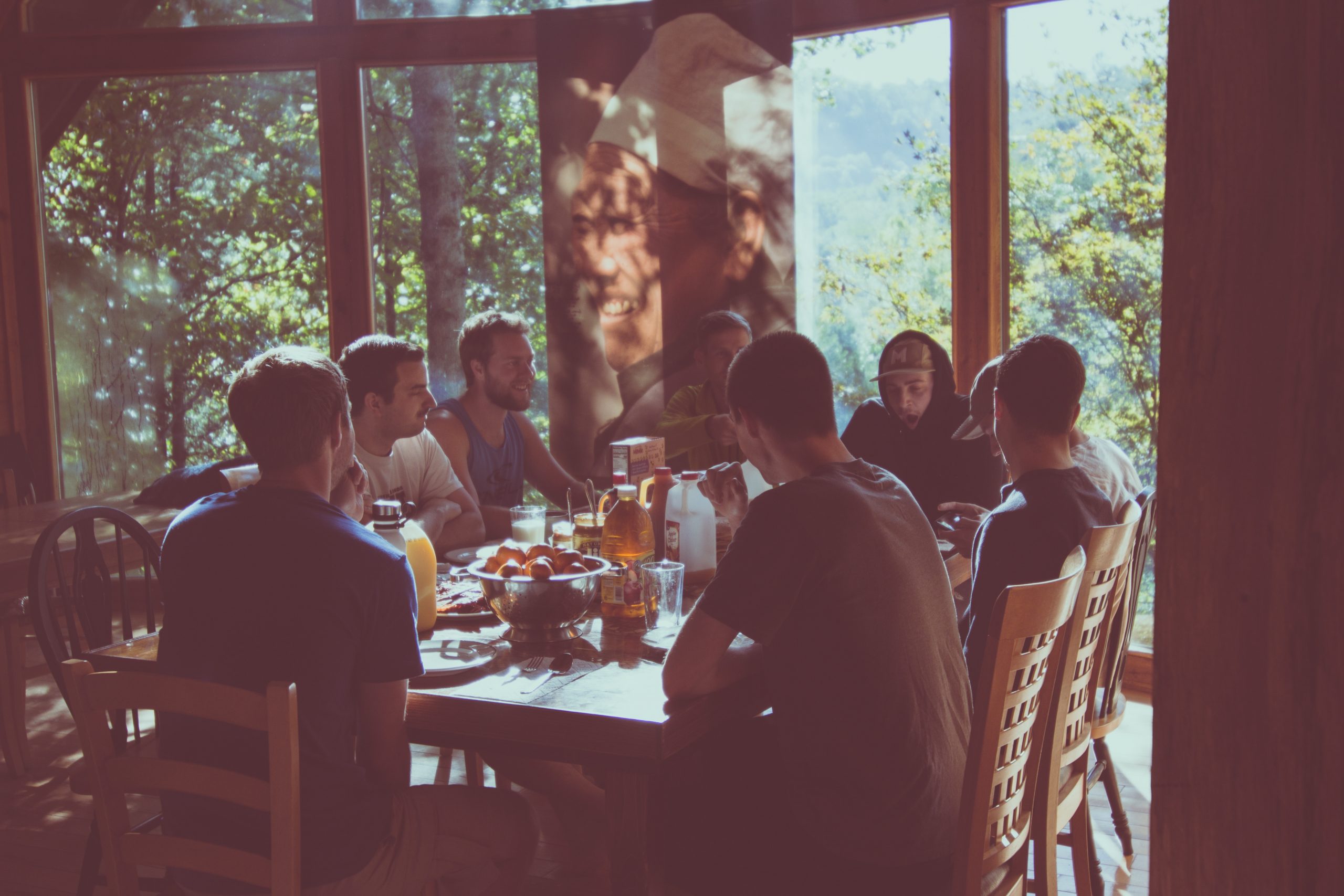
Feature photo by Zach Reiner on Unsplash

Jack has been in the internet marketing space for 10 years. He enjoys writing and watching the Toronto Raptors.
RECENT POSTS
- 5 of the Most Popular Streets in Toronto to Advertise Your Business
- Flyer Marketing: 25 Places to Distribute Your Flyer for Maximum Exposure
- Reddit Marketing: 9 Ways Small Businesses Can Benefit from an Active Reddit Presence
- Top SEO Tips For Hotels And Motels In 2026 – 8 Experts Chime In
- Google My Business: Should You Post Daily Updates? 5 Experts Chime In

Ready to chat about how Little Dragon Media can enhance your business?
Call us now at 647-348-4995 or

OUR AWARDS & CERTIFICATIONS


WHAT OUR CLIENTS ARE SAYING


Little Dragon Media's professionalism and commitment to delivering excellence are truly commendable. I highly recommend their services... Thank you for your stellar work!
- Delna Bharucha

Little Dragon Media worked on developing our logo and website. They did an absolutely AMAZING job on both projects. These guys ROCK and you won't be disappointed.
- Sonia Nutt

My team had a great experience working with Little Dragon Media. We will certainly engage with Little Dragon Media for any additional projects in the future. Highly recommend!
- Carly Rooney


- 682A St-Clair West Toronto, ON M6C 1B1
- (647)-348-4995
- info@littledragon.ca
MOST POPULAR SERVICES
RECENT POSTS
GET MORE CLIENTS
Don't let your competitors take over. We'll help you climb to the top and get more clients.


- 682A St-Clair West Toronto, ON M6C1B1
- (647)-348-4995
- info@littledragon.ca
MOST POPULAR SERVICES
RECENT POSTS
GET MORE CLIENTS
Don't let your competitors take over. We'll help you climb to the top and get more clients.

Contact | Press Mentions | Privacy Policy | Terms of Service
© 2024 Little Dragon Media. All Rights Reserved.

