

- January 23, 2020
-
 Jack Choros
In a previous blog post, we gave you the most effective restaurant menu design tips. If you haven’t taken a look at them yet, go ahead and do that now. If you’re one of those people that likes to read the TL; DR (too long, didn’t read) section of an article, here’s a summary of everything you need to consider when designing a menu:
- Understand your customer’s journey: What motivated the customer to choose your restaurant over other dining options?
- Consider demographics: Who is the restaurant for? How old are they? What do they do for work? What is their gender? How much do they make?
- Geography: How far is your customer willing to travel to get to your location? If you’re a fast food chain, odds are probably not that far. If you offer fine dining, maybe you’re customer is willing to make a short road trip.
- Understand their social life: Who do they interact with on social media or just in their personal life?
- Behaviours: How does your customer spend their time? What do they like to do?
- Use impactful photos, but not too many. Consider using illustrations.
- Use boxes to outline content.
- Don’t use currency symbols.
With the above tips and other considerations in mind, it’s time to look at some of the best, most eye-popping restaurant menu designs. Use what you’re about to see as inspiration, but again, make sure you consider who your target audience is and what drives them to come through your doors in the first place. And please, hire a good graphic designer.
The Rustic Restaurant Menu
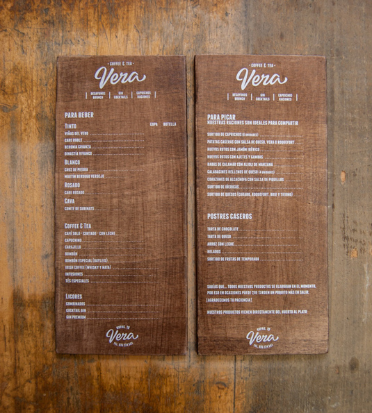
This is a perfect menu for any establishment trying to create that rustic, cabin-like feel. Great for a bar with a view of the local lake shore, or maybe a laid back seafood spot. This menu is also perfect for a place serving beach goers. This menu is courtesy of El Calotipo.
Pizza Anyone?
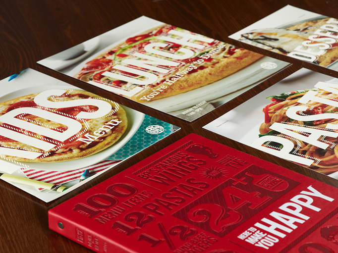
This restaurant might have an American sounding name, but it’s mostly familiar to Canadians. Boston Pizza. This chain restaurant does a great job of displaying it’s food in photos without overwhelming visitors. The cover of the menu also displays a clear cut branding message and some of the highlights you’ll find on the inside.
Western Themed Restaurant Menu

Imagine sitting down for a nice Western-style omelette while having brunch with your friends and seeing the omelette pop off of a menu like this. It’s another rustic design with room for nice imagery and the typeface is easy to read. It’s also a smaller menu that makes meal selection easy. Photo courtesy of Tzochko.
Imagine walking into a restaurant and seeing a menu that pops out at you. This design is definitely among the more modern looks you’d ever see. Great for a sports bar or chic bistro trying to separate itself from the local competition. Photo courtesy of Ellen Benway.
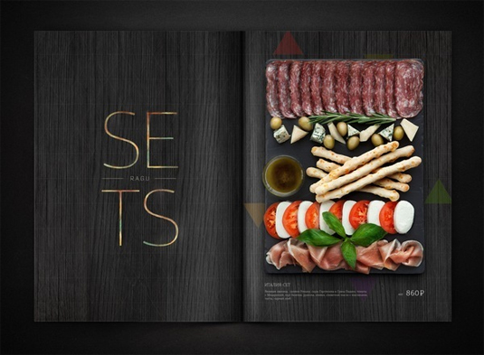
A Simple Black and (Off)White Look
This is a great look for an upscale Italian place. Just look at the antipasto in the picture, it’s perfect. Sometimes simplicity is the best approach. Especially if you have a lot of items on the menu. Photo courtesy of Jennifer Lucy Brzoza.
The Sushi Menu
Imagine walking into a sushi place and seeing a menu like this. This design looks both authentic and elegant. Lots of room to show off the best items on the menu. A simple typeface would be the touch that finishes off this design perfectly. Thanks to Ilya Levit for this design.
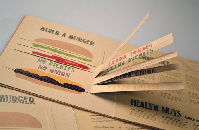
The Deluxe Burger Menu
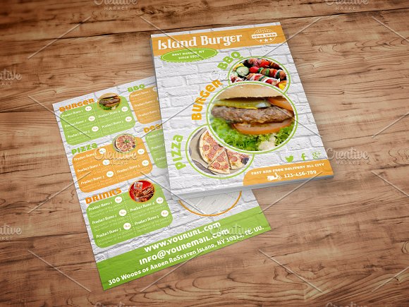
This is perfect for a specialty burger joint. The colours are fun, the font is easy to read and the pictures tell a thousand words. This menu fits right in between McDonald’s and a high-end burger joint that will run you a $25 tab for a burger and a drink. Knowing your brand is key in using this design. Photo credit to Luis Quesada.
World’s Best Drink Menu
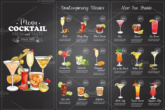
This is the best drink menu ever. It’s got a cartoon/comic vibe to it but is still elegant. Everything is spaced out nicely, the drawings are enticing and the descriptions are written in a nice hand-written font. This design works great for a dessert menu too, or a combination of both. Design courtesy of Netkoff.
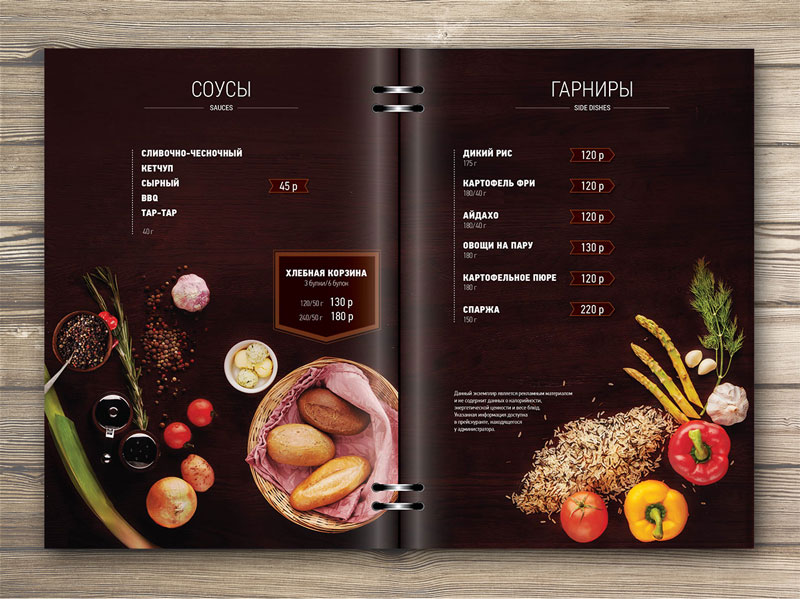
The Infographic Restaurant Menu
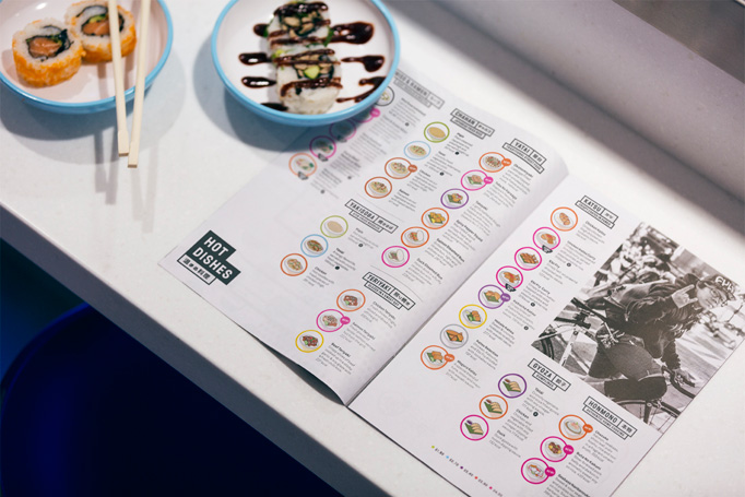
Look how these meals are depicted as little infographic icons. Isn’t that cool? The icons look engaging to anybody who’s on social media, and who isn’t these days? Obviously this doesn’t leave much room for the font, so it has to be small, but at least you’ll know exactly what you’re getting off this menu. There’s also room for nice photography and you can list a lot of items on one page. Lots to look at here but the infographic keeps your attention. This photo is courtesy of &Smith.
The Simple and Elegant Menu
This typeface is awesome and there’s clearly enough room to show off the items on the menu. Go for a down-to-earth feel with those images and present a welcoming, laid back vibe or put a little more production into those images and transform this beautiful design into something more elegant. Or both. Photo credit to Anne Reuse.
Featured image courtesy of Adam&Co.

Jack has been in the internet marketing space for 10 years. He enjoys writing and watching the Toronto Raptors.


Pingback: 15 Eye-Catching Restaurant Menu Designs - IronMonk Solutions