GOOGLE ADS MANAGEMENT
ALL SERVICES- GRAPHIC DESIGN & BRANDING
➥ WEBSITE DESIGN TORONTO
➥ TORONTO LOGO DESIGN
➥ BROCHURE GRAPHIC DESIGN
➥ INFOGRAPHIC DESIGN
➥ BUSINESS CARD DESIGN
➥ PACKAGE DESIGN TORONTO
➥ ILLUSTRATION DESIGN
➥ ADVERTISING POSTER DESIGN
➥ BRANDING STRATEGY & SERVICES- ➤ VIEW ALL SERVICES
WEB DEVELOPMENT & SUPPORT
➥ CUSTOM WEB DESIGN TORONTO
➥ ECOMMERCE WEBSITE DESIGN TORONTO
➥ WEBSITE MAINTENANCE SERVICES
➥ SHOPIFY WEBSITE DESIGN
➥ SHOPIFY EXPERTS TORONTO
➥ WORDPRESS DEVELOPMENT
➥ WORDPRESS MAINTENANCE- ➤ VIEW ALL SERVICES
WEBSITE MARKETING & CONTENT
➥ SEO PACKAGES TORONTO
➥ TORONTO SOCIAL MEDIA AGENCY
➥ CONTENT MARKETING TORONTO
➥ PPC MANAGEMENT TORONTO
➥ AFFILIATE MARKETING CANADA
➥ STRATEGIC CONSULTATION- ➤ VIEW ALL SERVICES
ABOUT
RESOURCES- LET’S CHAT
Questions? Call us at
647-348-4995
![]()
![]()
![]()
- December 13, 2018
-
 Sarah Bauder
One of the preeminent American art directors and graphic designers of the twentieth century was Paul Rand. Renowned for his designs of corporate logos, Rand was responsible for some of the most recognizable brands including the logos for IBM, UPS, Westinghouse, and ABC, just to name a few. Inarguably a genius of design, he once famously stated, “If, in the business of communications, ‘image is king,’ the essence of this image, the logo, is the jewel in its crown.”
The man knew what he spoke of. We here at Little Dragon have taken Paul Rand’s sentiment to heart. We believe that the logo is the essence of the brand, and that graphic design must be natural and completely original to have a brand stand out from the crowd. Take a look at these 10 graphic design tips for a kick-ass logo.
Know Thy Audience
There is infinitely more to logo design than just pretty images. Brand development is a vital component to creating a kick-ass logo. The most successful brands on Earth, are the ones that excel at storytelling that resonates with the right audience, and consistently conveys the right tone.
Take Apple’s logo, for instance. It exemplifies the company’s mission statement and tells a story that resonates with the masses – One that embodies user-friendliness, simplicity, and creativity.
Keep It Simple
It may be appealing to create a logo that’s complex, in an effort to make it interesting. Yet, more often than not, simplicity is your friend. Some of the most famous brands (think the aforesaid Apple, Nike’s swoosh, or IBM) all have logos that contain few elements and are incredibly simple. The visual imagery a brand’s logo conveys plays a vital role in the overall success of that brand.
The Power of Colour
Colour plays a vital role in conveying ideas and feelings, which is the purpose of any logo. Because a logo is the ethos of a brand, it should instantly evoke an emotion and grab the attention of a target audience. The power of colour in logo design is very influential in communicating meaning. That said, a kick-ass logo must be versatile, and still function in grayscale, or black and white, for instance.
Use Proportion and Symmetry
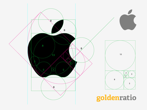
The most kick-ass logos are designed adhering to proportion and symmetry. In the graphic below, the circles show how the Apple logo has consistent arcs and curves. By making it proportional as well as symmetrical, the logo is well balanced and creates a pleasing aesthetic.
Make It Memorable
One of the main reasons for having a logo in the first place is that immediate association with the brand. This is crucial. A kick-ass logo should be memorable, something that is uniquely recognizable. It must convey the right identity and meaning that resonates with people, thus, making the logo instantly recognizable out in the world.
Versatility
Versatility is key for kick-ass logo design. A logo should be easily adaptable for a variety of mediums, be it on products, websites, business cards – anywhere with brand recognition.
Modern, Not Trendy
There is a profound difference between “modern” and “trendy”. A kick-ass logo embodies a modern aesthetic. It epitomizes the characteristics of the respective times, but without losing its identity and that of the brand it represents. On the other hand, “trendy” is very much of-the-moment. It will inevitably fizzle out, usually faster than anyone thinks. Always lean towards modern, not trendy with logo design. Take a gander below at the evolution of the Starbucks logo. Each one effectively represents the respective period, but still conveys the ethos of the brand.
Sometimes Motion is Advantageous
Although not always applicable (ie. the Apple logo), adding a sense of motion to logo design can be advantageous. In 2012, Twitter rebranded their logo to much fanfare and lauding. The company changed the colour and shape of their famous bird logo, tilting it ever so slightly upwards. That upward trajectory denotes movement, making it more unique from both a conceptual and visual sense.
Never Undervalue Typography
Some of the most kick-ass of all logos contain customized typography. Unfortunately, the custom font in a logo is all too often undervalued. Yet, it is one of the vital elements in making a logo unique and memorable. Be mindful of the dreaded clichés, or overused design styles, however. Take a gander below at the iconic Coca-Cola logo, which perfectly embodies effective use of typography.
Meaning is Crucial
“Meaning” has been mentioned a couple times already I this article, and it is crucial for kick-ass logo design. Random images, colours, and words lumped together will never succeed in creating an effective, memorable logo. Succinctly defining a brand’s mission statement, something that represents its identity and conveying its story, is vital in creating a kick-ass logo.

Sarah Bauder is a senior content specialist at Little Dragon Media. Sarah has a degree in journalism and has a decade of experience writing content at numerous renowned publications. She enjoys writing about digital marketing, business, entrepreneurship and more.
RECENT POSTS
- Top 11 Canadian Business Bank Accounts (Comparing Fees & Reviews)
- PolicyMe – Legit Canadian Insurance Policy? Let’s Review…
- 10 Small Business Loans & Financing Options in Ontario
- Top 8 Small Business Insurance Providers in Canada (2025)
- SCAM ALERT: How a Fake Google Ads Inquiry Nearly Got Us (And How to Protect Yourself)

Ready to chat about how Little Dragon Media can enhance your business?
Call us now at 647-348-4995 or

OUR AWARDS & CERTIFICATIONS


WHAT OUR CLIENTS ARE SAYING


Little Dragon Media's professionalism and commitment to delivering excellence are truly commendable. I highly recommend their services... Thank you for your stellar work!
- Delna Bharucha

Little Dragon Media worked on developing our logo and website. They did an absolutely AMAZING job on both projects. These guys ROCK and you won't be disappointed.
- Sonia Nutt

My team had a great experience working with Little Dragon Media. We will certainly engage with Little Dragon Media for any additional projects in the future. Highly recommend!
- Carly Rooney


- 682A St-Clair West Toronto, ON M6C 1B1
- (647)-348-4995
- info@littledragon.ca
MOST POPULAR SERVICES
RECENT POSTS
GET MORE CLIENTS
Don't let your competitors take over. We'll help you climb to the top and get more clients.


- 682A St-Clair West Toronto, ON M6C1B1
- (647)-348-4995
- info@littledragon.ca
MOST POPULAR SERVICES
RECENT POSTS
GET MORE CLIENTS
Don't let your competitors take over. We'll help you climb to the top and get more clients.

Contact | Press Mentions | Privacy Policy | Terms of Service
© 2024 Little Dragon Media. All Rights Reserved.

