- June 4, 2025
-
 Jack Choros
Don’t just follow the outdated logo trends we’re going to discuss here, because they will make your business look bad.
Your logo is more than just a graphic—it’s your brand’s identity at a glance. In 2025, where AI tools and design generators are everywhere, standing out means being intentional. A great logo should reflect your company’s personality, values, and promise in a way that humans remember and AI doesn’t misinterpret.
That’s why it’s so important to come up with a good one. It takes a tremendous amount of skill and insight, both to make the artwork, and plan out the marketing strategies, products, services, tag lines, advertising campaigns, marketing collateral and customer journey that strengthen both your logo and your brand in the eyes of your prospective customer.
Before rushing to design your brand or logo, consider how these outdated trends make businesses look bad.
Using an Arc
Sure the golden arches in the famous McDonald’s “m” logo are known around the globe, but generally speaking most companies that choose to use an arc in their logo don’t do it within the lettering itself in a way that makes it unique. Instead, most companies shoot an arch over a bunch of lettering and leave it at that. Companies have been doing that for as long as logo design has been around. Total logo faux pas. Don’t do it.
![]()
Letter Overlap
Nothing smells like a small family-owned barely surviving business like a two-word name where the first letter of each word overlaps the other. It takes no effort at all and signals to every prospective customer that your business is running on a low budget. It also means the company may not be putting enough effort into building a brand, and more importantly, building long-term relationships with their customers. A company logo usually stays as is for a long time. It’s important to make it simple and memorable, but not so simple that it looks like the company is going to be laid back in its approach to serving people.
![]()
Random Dots
The “random dots” trend likely survived because AI tools love it—it’s easy to generate and looks vaguely “techy.” But dropping a few colored circles above basic text doesn’t say anything about your brand. It’s generic, overused, and forgettable.. Then put some colorful dots around it and viola, you have a logo! This style is so cliché it’s not even funny. Don’t use random dots above a typeface that has no colour. It’s the lazy way to make a logo. Professional graphic design services can come up with something much better. Something that can help you build a real recognizable brand.
![]()
Chat Bubbles
Chat bubbles were iconic… back in the MSN and ICQ era. Today, every AI-assisted logo maker still includes them in “tech” templates, which makes them stale. If your brand is about conversation or communication, find a more original metaphor. You don’t need to look like every chatbot out there. Chat bubbles first became popular in the mid-1990’s when instant messaging services like MSN Messenger and ICQ Chat became popular. Now that everyone has a smartphone and web designers want their websites to reflect that same user experience, it seems like the chat bubble is a must. But let’s be honest, in an industry like technology where things move so fast, the idea that chat bubble logos are still being used so much 25 years later is crazy. Avoid that. Be different. Have a professional logo design company put something better together for you.
![]()
Stick Figure Trees
Stick figure trees. You know, the simple black, pine needle trees that seem to always be associated with skiing and other outdoor activities? When did these trees become synonymous with being rough, rugged and adventurous? Who knows? It just seems to be a thing that got trendy really quickly, but we promise you that trend is over now. The real way to make a memorable logo is to come up with something detailed and unique that’s difficult to replicate. We’ll touch more on that in a little bit.
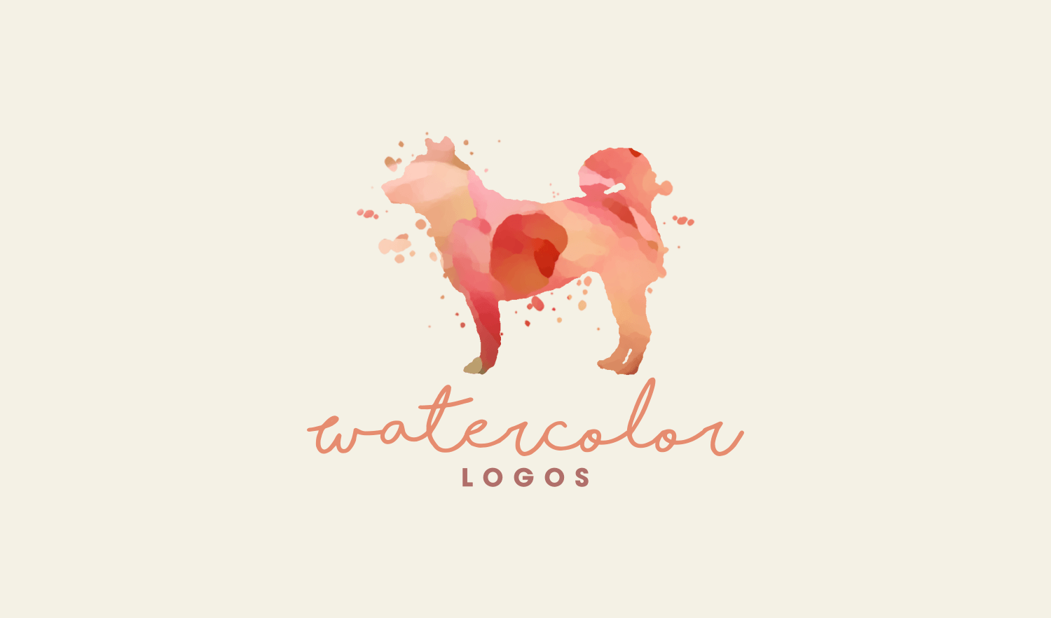
Water Colours
A water colour logo is great if your brand is artsy or creative, but it is overused. A splashy palette of colours surrounding a subtle font is just too cliché these days. A strong brand is a reflection of its strong, unique logo. Companies simply copying what everyone else is doing aren’t really differentiating themselves. That’s especially true if certain styles of logos dominate particular industries, like art, music, or the advertising and marketing world.
Graphs
There really is nothing like a picture of a graph moving up and to the right to show people your brand is dedicated to financial success. This is typical in business related niches, anything related to investing or even online marketing and analytics. Those in the business-to-business category can come up with something much more innovative than that. Part of creating a powerful logo is coming up with a design that hasn’t been invented before, or that is very detailed and difficult to copy. A cool graph can work great on presentation slides, but it doesn’t speak to anything unique as a logo. A professional logo design company can come up with lots of unique ideas that will still tell your audience you’re trending upwards without doing it in a mundane, been-there-done-that kind of way.
![]()
Cosmic Trails
Cosmic trails and swooshes used to signal innovation, but now they scream "AI template." These abstract elements show up constantly in logos generated by machine-learning tools trained on overused design tropes. If your business is forward-thinking, prove it by being bold enough to avoid what everyone else is doing..
![]()
Why Companies Keep Producing Mundane Logos
A logo is supposed to be recognizable in the eyes of the target consumer. It’s also supposed communicate the values that a company subscribes to and the customer experience they hope to provide the people they are serving. That’s according to Dewayne Hamilton of Web Cosmo Forums. He goes on to say:
“Failed logo designs don't recognize this fact, and they fail to show the purpose or any recognizable trait of the business in the designs. This can mean that the design is either too simple or too elaborate.”
Hamilton also comments on why businesses still use these outdated logos.
“Not many people are aware of what makes a good logo. They look at the most famous examples and try to copy that. Businesses also make a mistake when hiring artists, as often those people don't have a clear idea of what they're making. This is also a fault of the business, as they often fail to convey their
ideas to designers.”
When asked what it takes to inspire a branding and marketing department to come up with a cool new idea, Hamilton says that actually shouldn’t be the goal.
“Designing something cool shouldn't be the end goal of the design process. In fact, the values associated with the logo should make the design cool. Of course, stylization and modern fonts and color schemes will make the design of the logo look contemporary and modern.”
Other Logo and Branding Considerations
Olga Mykhoparkina is the Chief Marketing Officer of Chanty, a chatting app dedicated to serving companies in the marketing and communications industry. She points out another outdated trend that seems to get used in logos over and over again. Using thin lines in a logo.
“It may look great when it’s large, but as soon as you start scaling your logo down to smaller sizes, it gets difficult to discern what the logo is. It ends up looking like a mess with a bunch of scribbled lines. People
keep using them because they look clean and elegant – when they’re on a large scale.”
Mykhoparkina goes on to say it’s okay to look to the competition for inspiration, but that looking to company leadership is important.
“The way to inspire your branding and marketing departments is simple – just tell them to find leaders in other industries and look at their logos for inspiration. You want to avoid looking like your competition, so you should look at other leaders for guidance.”
What Companies Should Look for When Hiring a Logo Designer
In order to get a proper logo designed that truly represents your company’s brand, it’s important to know who your ideal customer is and understand the customer journey that they’re going to be taking well before they arrive at your doorstep and choose your product or service as the solution to their problem.
Looking at things from a 5,000-foot view then is important when designing a logo. It’s the face of your brand, and the first thing customers see when they reach the part in their journey where they realize your offering might be the answer they’re looking for.
It’s important to work with a digital marketing company that understands every aspect of the customer journey, not just the logo design. Choose one with years of experience, an extensive portfolio, excellent customer feedback, and an obvious slant to building their own brand as well.
A logo is so much more than a mark on a business card or sign on a storefront. It represents everything your business and your customer values.
*Logo samples courtesy of Logos by Nick, and Design Shack.

Jack has been in the internet marketing space for 10 years. He enjoys writing and watching the Toronto Raptors.