GOOGLE ADS MANAGEMENT
ALL SERVICES- GRAPHIC DESIGN & BRANDING
➥ WEBSITE DESIGN TORONTO
➥ TORONTO LOGO DESIGN
➥ BROCHURE GRAPHIC DESIGN
➥ INFOGRAPHIC DESIGN
➥ BUSINESS CARD DESIGN
➥ PACKAGE DESIGN TORONTO
➥ ILLUSTRATION DESIGN
➥ ADVERTISING POSTER DESIGN
➥ BRANDING STRATEGY & SERVICES- ➤ VIEW ALL SERVICES
WEB DEVELOPMENT & SUPPORT
➥ CUSTOM WEB DESIGN TORONTO
➥ ECOMMERCE WEBSITE DESIGN TORONTO
➥ WEBSITE MAINTENANCE SERVICES
➥ SHOPIFY WEBSITE DESIGN
➥ SHOPIFY EXPERTS TORONTO
➥ WORDPRESS DEVELOPMENT
➥ WORDPRESS MAINTENANCE- ➤ VIEW ALL SERVICES
WEBSITE MARKETING & CONTENT
➥ SEO PACKAGES TORONTO
➥ TORONTO SOCIAL MEDIA AGENCY
➥ CONTENT MARKETING TORONTO
➥ PPC MANAGEMENT TORONTO
➥ AFFILIATE MARKETING CANADA
➥ STRATEGIC CONSULTATION- ➤ VIEW ALL SERVICES
ABOUT
RESOURCES- LET’S CHAT
Questions? Call us at
647-348-4995
![]()
![]()
![]()
- December 2, 2019
-
 Jack Choros
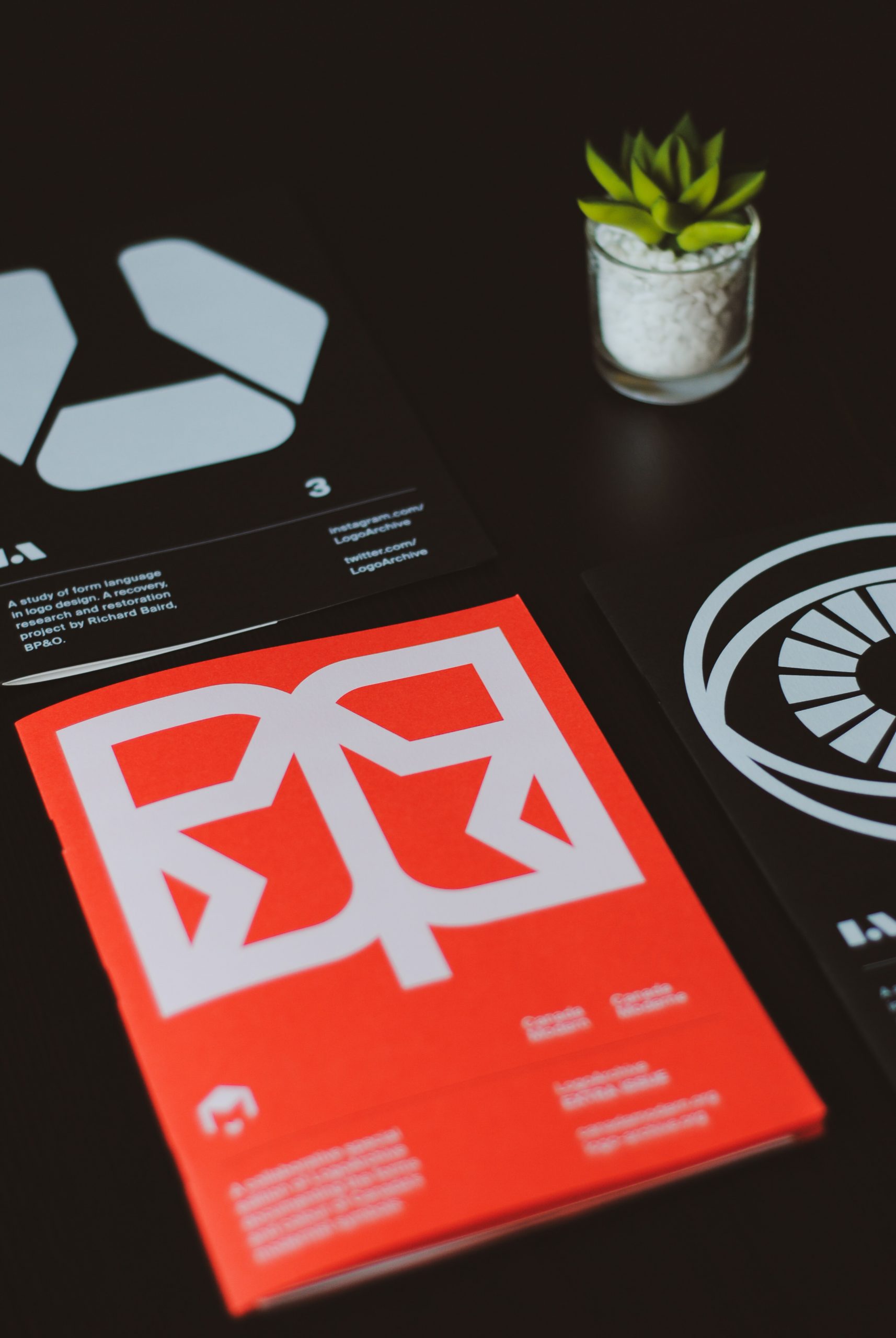
When you think of putting together a brochure for your company or project, you probably think of something that folds in thirds, has a generic stock photo on the front of someone smiling and features a few nice headings with some text on a white background. While most brochure designs you pick up at your doctor’s office follow this template, the truth is you don’t need to limit your brochure designs to that kind of a traditional style. There are so many things you can do with graphic design that you’ve probably never seen before.
Before we jump into examples of brochure designs, and we definitely will, let’s go over some basic tips that will help you come up with amazing ideas that are truly outside the box. After all, the whole point is to get brochures into people’s hands, with the goal of exposing them to your brand, product or service and giving people the information that you really want them to know.
Once we get into that, we’ll go into some actual designs.
Tips for Making Cool Brochure Designs
Alright, before we get into design tips, let’s talk about ideation from a broader perspective. A brochure isn’t just an excuse to share information, it’s an extension of your brand. Don’t just use the same template everyone else uses. Don’t use the same cheesy stock photos. Do something different. That means:
- Playing with the layout.
- Using a unique font.
- Using a cool color scheme.
- Writing engaging copy.
- Pay for quality paper and printing.
- Get samples of different designs done.
Playing with the Layout
Your brochure doesn’t just have to be three paragraphs on three separate panels. There are all kinds of ways to separate content and use headings. Play with that. There’s no rule that says you have to follow the same basic format. Graphics, colours and font styles can also play a role in this.
Use a Unique Font
Does your company have branding style guidelines? If so you want to use the same font for your brochures that you use for everything else. On a subconscious level, keeping things consistent teaches people that your brand is unique. Picking up font that stands out but is still easy-to-read is important. It lets people know that you’ve really put thought into your brand.
Use a Cool Colour Scheme
Again, try matching the colours you use with your brand. It was so consistency. Use multiple colours that blend well together and have other people in the office take a look at them to see what they like.
Pay for Quality Printing and Paper
This is one of the most underappreciated parts of putting together a good brochure that lasts. Feel is just as important as look. You want to be able to hold that brochure in your hands and feel like you’re holding onto something that you would keep. Of course of the content inside the brochure is good it gives the reader all the more reason to hold onto it, but even the feel of it can help that feeling rise to the surface.
Write Engaging Copy
Engaging copy should tell your brand story. It should highlight the features, advantages, and benefits of using your product or service for working with your company. A brochure isn’t necessarily the medium you want to use to hard sell your prospects, but it can certainly warm them up as they move along their customer journey.
Get Different Samples and Styles of Brochures
This is the best way to test out all of the above. You’ve got to try different styles and samples of brochures. Figure out what you like. Ask other people what they like. Test different ones with your prospects and see which ones they pick up off of your wall or coffee table. Choose the favourite and stick with it.
Top Kickass Brochure Designs
Here are some of the top brochure designs we’ve found. You can re-create each of them using a professional graphic design service.
Branding Guideline Brochure
This brochure should probably be for you as much as it’s for other people. If you want to explain your brand to a creative design service or a customer, this would be an essential layout. You can show off all of your brand’s colour schemes, communication styles, fonts, looks and feels with this brochure.
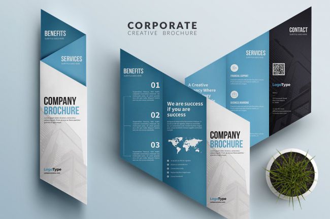
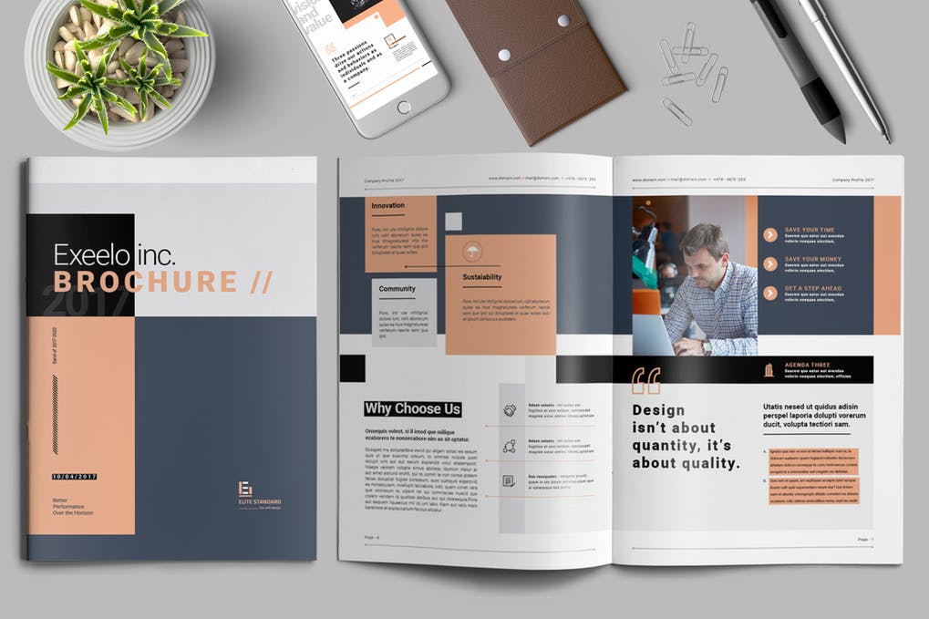
A Corporate Trifold Brochure
This design uses a folding technique on the diagonal cut of the brochure. The colours make it easy to read and definitely provide lots of room to represent your brand. The bolded font makes it easy to read and you can make it in any colour that you want.
The Magnolia Lookbook
This design is great for anybody in a creative niche. It allows you to show off your work. The layout is minimal but offers plenty of room to display images. The ironic part about the Lookbook is that if you’re in a creative light of business, you might be able to create this yourself but obviously it’s better to go with a marketing agency that has expertise in how to make marketing collateral really pop.
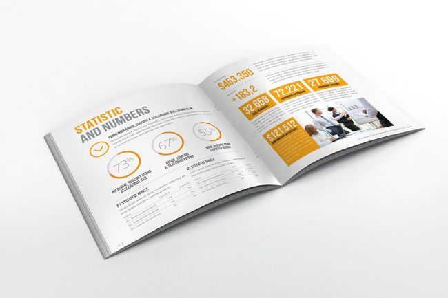
The Annual Report Brochure
If your business needs to convey facts and figures to prospects, you need the annual report brochure. It’s a very simple layout but allows you to provide graphics, charts, facts and figures to your target audience and an easy-to-read format that’s very professional.
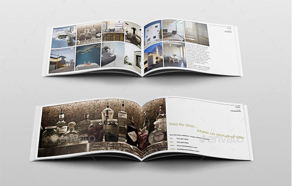
The Trendy Brochure
This trendy brochure allows you to show off creative work in a panoramic format with lots of room for text on the right side. This is a great brochure to use for showing off any kind of portfolio, but works particularly well when it comes to interior design or anything home and lifestyle related.
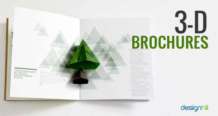
The 3D Brochure
Can you imagine if your prospect opened up a brochure and saw something physically pop out at them? When is the last time you saw anything like that? This design is pretty cool, it really stands out. Imagine doing this with your company logo. This is actually the kind of brochure that somebody might keep just because it looks cool. Anytime you develop marketing collateral for your target audience, you want it to be good enough to hold onto, because it takes a minimum of seven impressions to sell somebody something, and anything worth holding onto will make an impression over and over again.
Festival Brochure
Here’s a great one for promoting a party, festival or conference. Its bright colours are really engaging and there’s lots of room for content that explains what’s going on at your event. Usually festivals and conferences last entire days or entire weekends, so you want to build a jam as much content as possible into the brochure to give off the impression that it’s going to be a really busy and exciting time when you come to this event.
The Book
This book is perfect as an in-depth guide. If somebody picks this up and reads through it, you know they’ve got to have a keen interest in what you have to offer. This style is really good for any niche involving dense material like insurance or retirement. It can also be used in creative and marketing related niches to show off branding and strategy to a prospect.
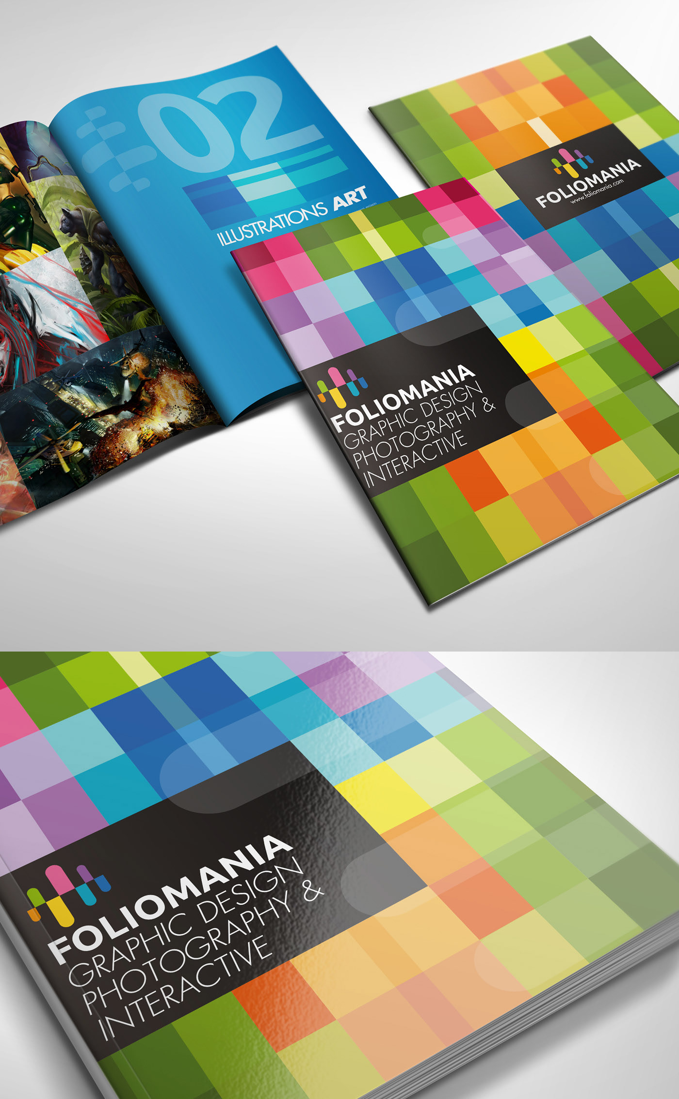
FolioMania
This style is called FolioMania. It’s perfect for art and design related niches. Look at how the colours blend together so nicely and catch the eyes. It’s impossible not to look at this brochure in detail. Throw in some cool works of art and design and there’s no way people won’t want to walk away with this when they leave the office. Make a great impression with FolioMania.
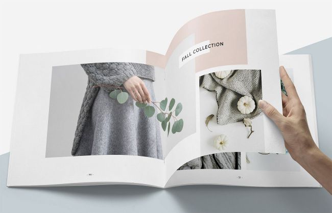
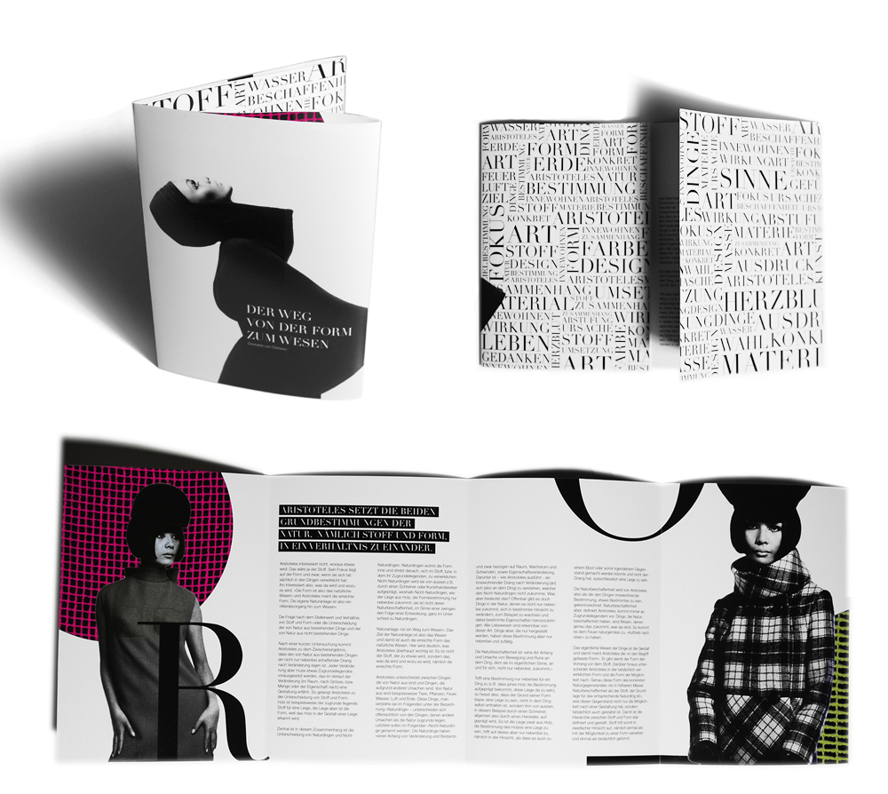
High End Fashion
Here’s a chic look for anybody in the clothing or fashion niche. This design screams high end. You’re not going to want to sell small little trinkets with this design but anything related to specialty or high-end quality will work well. This is definitely a niche-specific design.
Other Marketing Considerations That Bring Brochures Full Circle
Brochures should be an extension of your brand. These days of people are walking into your office and picking up a pamphlet or brochure, it means that your sales strategy is already working. That means you’ve invested in website development that really pops and reflects the value proposition and offering that you’re trying to create for your prospects.
To get people to your website in the first place, you’ve got to be able to implement a strong pay-per-click advertising strategy. This means looking for a digital marketing agency that has experience and understands your target customer. Unlike looking for a brochure to publish content on which is mostly a visual consideration, these other aspects of marketing involve critical thinking, testing and planning on a level that most business owners may not be able to handle themselves.
So now that you have some of the best tips on how to create kickass brochures for your business, consider how the designs fit into your branding and your broader marketing strategy. Even if you have that all in place, you likely need help from experts to pull it all off and keep the fresh leads coming in. Hire a digital marketing agency in Toronto for that.
*Brochure photos courtesy of CreativeBloq, DesignHill, Behance, and Envato.
Feature image by Hello I’m Nik 🇬🇧 on Unsplash.

Jack has been in the internet marketing space for 10 years. He enjoys writing and watching the Toronto Raptors.
RECENT POSTS
- SCAM ALERT: How a Fake Google Ads Inquiry Nearly Got Us (And How to Protect Yourself)
- Google My Business: 9 Tips to Ensure Your GMB profile Stands Out in the Map Pack
- 8 Outdated Logo Design Trends That Are Making Your Business Look Bad
- How We the North Became the Toronto Raptors’ Rallying Cry
- Is A Dedicated IP For SEO A Myth Or Reality? – 13 Experts Weigh In

Ready to chat about how Little Dragon Media can enhance your business?
Call us now at 647-348-4995 or

OUR AWARDS & CERTIFICATIONS






WHAT OUR CLIENTS ARE SAYING



Little Dragon Media's professionalism and commitment to delivering excellence are truly commendable. I highly recommend their services... Thank you for your stellar work!
- Delna Bharucha

Little Dragon Media worked on developing our logo and website. They did an absolutely AMAZING job on both projects. These guys ROCK and you won't be disappointed.
- Sonia Nutt

My team had a great experience working with Little Dragon Media. We will certainly engage with Little Dragon Media for any additional projects in the future. Highly recommend!
- Carly Rooney


- 682A St-Clair West Toronto, ON M6C 1B1
- (647)-348-4995
- info@littledragon.ca
MOST POPULAR SERVICES
RECENT POSTS
GET MORE CLIENTS
Don't let your competitors take over. We'll help you climb to the top and get more clients.



- 682A St-Clair West Toronto, ON M6C1B1
- (647)-348-4995
- info@littledragon.ca
MOST POPULAR SERVICES
RECENT POSTS
GET MORE CLIENTS
Don't let your competitors take over. We'll help you climb to the top and get more clients.

Contact | Press Mentions | Privacy Policy | Terms of Service
© 2024 Little Dragon Media. All Rights Reserved.

