- January 29, 2024
-
 Liam Hunt
Hockey logos are known for being some of the best in sports—from the iconic horn-and-tail emblem of the New Jersey Devils to the Arizona Coyotes’ nineties-inspired “Kachina” design. But, like other sports, hockey logos aren’t just cool designs on a jersey; they're like the team's signature, telling a story about who they are and what they stand for.
As a Toronto-based digital marketing and graphic design agency, we’re not new to hockey logos. And as a long-time player myself, I know what goes into a winning logo versus a dud.
Above all, logos create a special connection with the fans. When players pull on their jerseys, they become part of something bigger than their team. Whether it's a classic symbol that's been around for ages or a modern design, logos are the heart of hockey fandom: they’re what we wear on our t-shirts, hats, and merch to showcase our passion to the world.
Let’s lace up our skates and explore what makes a good hockey team logo and delve into the design elements that transform a simple logo into an iconic emblem.
Key Elements of Iconic Hockey Team Logos
Below, I’ve listed some of the top design elements that our in-house Toronto graphic designers identified as being key to good hockey team logos.
1. Simplicity
The best hockey logos are often simple. A logo should be easily recognizable, even from a distance or when scaled down. Think of it as the 'glance test'—if you can understand the logo with a quick glance, it's on the right track.
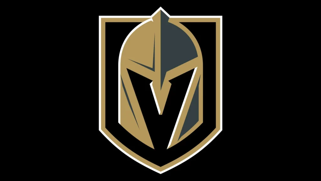
When I think of simplicity in hockey logos, I think of the Vegas Golden Knights. It’s a basic crest that doesn’t leave anyone guessing as to what it makes, forming the shape of a “V” for Vegas.
(Need your own simple hockey logo? Consider hiring our team of in-house logo designers to craft a perfect hockey logo for your squad.)
2. Symbolism
Logos tend to incorporate symbols that are meaningful to the team or its location. This could be a local animal, a historical reference, or a symbol of the team's spirit.
A good example of a pro hockey team that uses symbolism in its logo is the Chicago Blackhawks. The Blackhawks' logo is a stylized profile of a Native American head, which is rich in symbolism and historical reference. It’s designed to honor Black Hawk, a leader and warrior of the Sauk Native American tribe.
The ‘Hawks logo represents strength, honor, and the proud history of Native Americans, particularly associated with the Illinois region where the team is based. 'Knowing your audience' is one of the key elements of a good logo, and the Blackhawks certainly have that aspect down pat.
The use of culturally sensitive imagery in sports logos can lead to difficult yet important discussions about cultural representation and sensitivity—so I recommend avoiding any culturally sensitive symbolism in your logo unless the players themselves are a part of a cultural group to whom the symbol belongs.
3. Color Pallette
Colors, of course, play a crucial role in logo design. They should reflect the team's identity and be appealing to the eye. For instance, the Golden Knights’ use, predictably, use a classic combination of gold and black; whereas the Red Wings use a traditional red and white.
While there are a lot of excellent color combos to choose from, there are also some that should be avoided like a Jacob Trouba hip check. Here are some color combinations that generally don't work well together:
- Neon Green and Bright Pink: These overly vibrant colors can clash and be jarring to the eye, making the logo or uniform look garish.
- Bright Red and Bright Green: Often associated with Christmas, this color combination can be distracting on a hockey uniform and may not convey the intended team branding.
- Dark Brown and Dark Purple: Both being dark and subdued, these colors can blend into each other, leading to a lack of contrast and visual appeal.
- Bright Orange and Bright Blue: Depending on the shades, these colors can clash and create a visually unharmonious look.
- Yellow and Neon Green: Both are bright, high-energy colors that can be overwhelming when used together and may cause the logo or design elements to lose definition.
- Bright Purple and Bright Yellow: While they are complementary colors, overly saturated shades of each can be jarring and create an unpleasant visual contrast.
Note that the effectiveness of color combinations can also depend on factors like the specific shades used, the context of the design, and cultural associations. In some cases, skilled logo designers can make unconventional color combinations work by carefully balancing elements like hue, saturation, and brightness. In short, the basic elements that go into a good hockey logo are mostly the same as those that make a good dentist's logo, law firm logo, or restaurant logo—it starts with choosing the right colors, and adjusting them accordingly.
4. Uniqueness
In the game of hockey, where traditions run deep, having a unique logo helps a team stand out. It should differentiate itself from other teams while still respecting the sport's history.
It’s a bit out of left field (or, I guess, off the left boards), but one logo I find really unique is the one used by the Toledo Walleye of the ECHL (East Coast Hockey League). I consider the Toledo Walleye’s logo distinctive for a several easons:
- Thematic Relevance: The logo cleverly incorporates a walleye, a type of fish found in the region, tying the team's identity to its geographical location in Toledo, Ohio, near the Great Lakes.
- Visual Appeal: The walleye in the logo is stylized with a fierce, competitive look, which is fitting for a gritty hockey team. The fish is depicted with sharp, pointed teeth and an aggressive eye, conveying a sense of strength and determination.
- Color Scheme: The logo uses a unique color palette that includes shades of blue, yellow, and white, which stand out among more common color combinations found in sports logos. The only team I can think of that has used this color scheme is the Pittsburgh Penguin’s during their 2011 Winter Classic game.
- Integration of Hockey Elements: The walleye in the logo is shown holding a hockey stick, which seamlessly integrates the theme of the logo with the sport of hockey.
This logo is an excellent example of how a team can use local themes and creative design elements to create a distinctive and memorable visual identity.
5. Adaptability
A good logo works across various mediums, from jerseys to digital platforms. It should be versatile enough to look great on merchandise, social media, and large banners.
When it comes to adaptability, I can’t think of a better example than the Detroit Red Wings’ logo. The Red Wings' logo exhibits several key aspects that make it highly adaptable across various mediums:
- Timelessness: The design has remained largely unchanged since its introduction in 1932, proving its enduring appeal and timelessness. While many designs can quickly look outdated, the Red Wing logo's longevity demonstrates its ability to adapt to changing trends and aesthetics.
- Scalability: The logo scales well both up and down. It maintains its integrity and impact whether it’s on a small digital icon on social media or a large jersey print, making it versatile for various marketing and branding needs.
- Symbolic and Historical Significance: The winged wheel is a symbol of the automotive industry, closely associated with Detroit's history as the Motor City. This adds a layer of meaningful storytelling to the logo, enhancing its appeal.
The Detroit Red Wings' logo is a prime example of how to do a hockey logo the right way. With a timeless and adaptable logo, a design can transcend its initial purpose and become a versatile symbol across multiple platforms and products.
Examples of Iconic Hockey Logos
Now, let's lace up and skate through some examples of famous hockey team logos that have left an indelible mark in the hearts of fans. These are all excellent, timeless hockey logos to take inspiration from, and they rank among my all-time personal favorites.
1. Toronto Maple Leafs
One of the most iconic logos in hockey, the Maple Leafs' logo, is simple yet powerful—and it’s not just because I grew up a die-hard Leafs fan.
The simplicity of the logo is one of its greatest strengths. The clean lines and uncluttered design make it easily recognizable and visually striking, ensuring it stands out whether on team jerseys, merchandise, or media. This simplicity also lends the logo a timeless quality; while it has undergone updates over the years, its core design remains consistent, maintaining a connection to the team's long and storied history.
The maple leaf is not only a national symbol of Canada, but also represents the team's roots in Toronto. The simplicity of the design makes it instantly recognizable, and the navy blue color scheme helps it stand out in a league dominated by red, yellow, orange, and gold sweaters.
Beyond its visual appeal, the Toronto Maple Leafs logo carries a weight of history and emotion. For me and millions of other fans, it evokes memories of legendary players and historic moments, making it a symbol of both nostalgia and ongoing passion. It’s a logo that represents not just a hockey team, but a franchise deeply intertwined with Canadian hockey culture.
2. Montreal Canadiens
Even as a Leafs fan, I can’t deny that the ‘Habs’ logo is a classic. The 'C' and 'H' intertwined represent “Club de Hockey Canadien” and the use of red, white, and blue embodies the team's rich history and French-Canadian heritage by borrowing from the national colors of Canada.
The logo's consistency over time contributes to its greatness. Despite minor tweaks, its core design has remained largely unchanged, reinforcing a sense of stability and continuity. In a sport that's constantly evolving, the Canadiens' logo serves as a reminder of the enduring legacy of French-Canadian hockey, connecting generations of fans and players alike.
3. Mighty Ducks of Anaheim
In my opinion, the Mighty Ducks of Anaheim had the best “new-school” logo out of any NHL expansion team. This logo is instantly memorable for its unique and playful design, a standout in the world of hockey logos that sometimes take themselves too seriously.
The logo, featuring a goalie mask shaped like a duck bill, directly ties into the team's name and the Disney movie that inspired it, "The Mighty Ducks". This connection made the logo recognizable and helped bridge the world of entertainment with sports. After all, there’s a reason why celebrities like Russell Westbrook, Mike White, and Joshua Jackson have all been seen sporting the 90s Mighty Ducks’ jersey in public.
The old school Ducks’ logo was more than just a symbol for the team; it was part of a larger cultural phenomenon in the 90s, making hockey accessible and fun to a broader audience. The design reflected a sense of fun and adventure, aligning well with the family-friendly image of Disney.
(Want your own timeless hockey logo? Hire our team of in-house logo designers to craft a beauty of a hockey logo for your team.)
4. Vancouver Canucks
The Vancouver Canucks' logo has undergone a bunch of transformations over the years, each reflecting different aspects of the team's identity and the region's culture. The most iconic version, often referred to as the "Orca" logo, stands out to me for its distinctive symbolism.
This logo features an orca whale, a powerful creature native to the Pacific Northwest, breaking out of the ice in the shape of a 'C.' The orca is culturally significant to the indigenous peoples of the region, representing strength, intelligence, and family. By incorporating this symbol, the logo pays homage to the local heritage and natural environment of British Columbia.
The color scheme of this logo, primarily navy blue, green, and white, is reflective of the Vancouver landscape, evoking the ocean, forests, and snow-capped mountains. This creates a strong geographical connection and resonates with the local fan base, drawing a timeless link between the design and the region that the team belongs to.

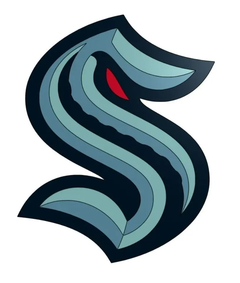
5. Seattle Kraken
A newcomer to the NHL, the Seattle Kraken's logo stands out for its modern and imaginative design, which perfectly captures the spirit of the legendary Kraken sea monster. The logo features an 'S' shape, reminiscent of the classic Seattle Metropolitans' logo, paying homage to the city's rich hockey history, while also subtly suggesting the form of the mythical Kraken, with a menacing tentacle curling up and a red eye peering through.
The color scheme of deep sea blue, ice blue, boundless blue, and shadow blue is unique and reflects the maritime theme. The use of multiple shades of blue creates a sense of depth and connection to the ocean, resonating with Seattle's identity as a prominent seaport city.
Officially unveiled in 2020, the Seattle Kraken’s logo design is sleek and modern, appealing to a new generation of hockey fans while maintaining a classic, timeless feel. It's versatile, looking equally impressive on team jerseys, merchandise, and digital platforms. The Kraken logo not only represents the team but also serves as a symbol of Seattle's connection to the sea.
6. North Bay Battalion
I grew up a fan of the North Bay Battallion when they were still located in Brampton, and to this day the team’s logo hockey kit remind me of childhood memories at the Powerade Center. As a junior hockey team in the Ontario Hockey League (OHL), the Brampton Battalion’s logo is both striking and symbolic. The design centers on a fierce, determined-looking soldier in combat attire, reflecting the team's name and tying in directly with the theme of resilience and strength.
The color palette of the logo, featuring army green, black, tan, and gold, is perfectly in tune with the military theme. These colors not only make the logo distinctive in the game of hockey but also resonate with the concept of a battalion, reinforcing the team's tough-guy identity.
One of the key aspects of the North Bay Battalion logo is its direct appeal to the sense of solidarity and fighting spirit, qualities that are essential in both military and sporting contexts. This created a strong emotional connection with me as a kid, who found myself rallying around the themes of unity and perseverance with other fans.

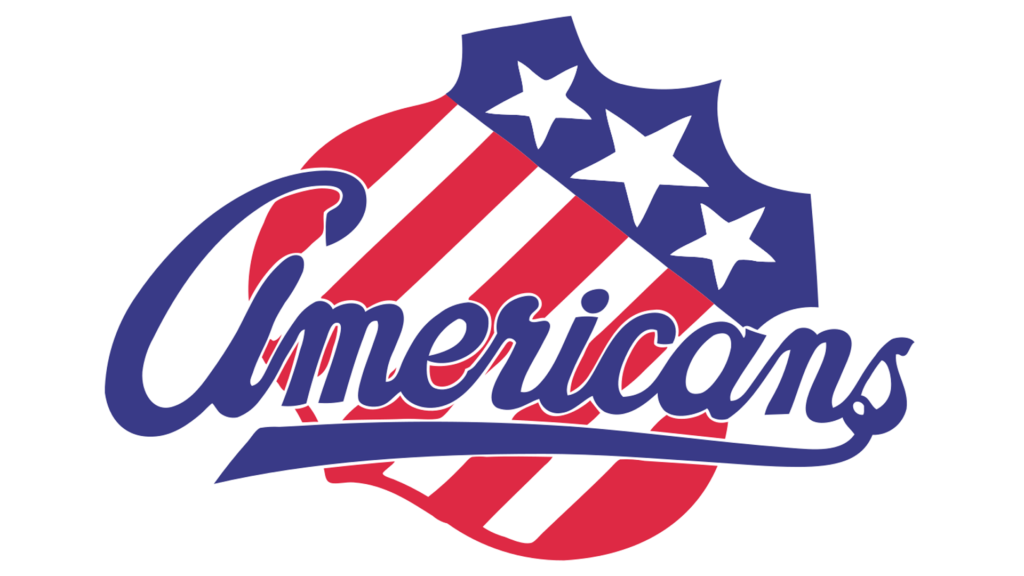
7. Rochester Americans
Although I’ve never really watched the American Hockey League (AHL), I’ve always been a fan of the logo design for the Rochester Americans—the farm team of the Buffalo Sabres. Affectionately known as the "Amerks," the Americans have a logo deeply rooted in American symbolism and hockey tradition.
The central element of the logo is a stylized "R" that stands for Rochester, with a star incorporated into the design, reflecting the team's American identity and patriotic spirit. The color scheme of the logo, primarily red, white, and blue, reinforces the American theme and is instantly recognizable. These colors are not only symbolic of the United States but also are vibrant and energetic, making the logo stand out on jerseys and merchandise.
Another notable aspect of the Amerks' logo is its timeless quality, having maintained its fundamental elements over the years, which appeals to a sense of tradition and history in the sport. This longevity helps foster a deep connection with fans like me who appreciate the storied past of one of the AHL's oldest teams.
Need Custom Hockey Logos? We’re Your MVP
Whether you’re a pro team or a beer league squad, creating a hockey logo is a huge step in forging your on-ice identity.
At LittleDragon.ca, we specialize in crafting custom hockey logos that resonate with your team's spirit and values. Our in-house designers create cool hockey logos that are not just visually stunning, but also tell your team's unique story.
We believe that your logo should embody your spirit, values, and history, while scoring in both design and emotion. Connect with us to bring your hockey logo to life, and let's create something that both you and your fans will wear with pride.
Reach out today to start your journey to an iconic hockey logo.
Liam Hunt, M.A., is a writer and digital marketing specialist whose writing has appeared in the Vancouver Sun, Asia Times, and US News and World Report.