- December 9, 2019
-
 Jack Choros
- General Tips
Knowing how to make a sign stand out is of utmost importance if you run a local business that depends on foot traffic. Restaurants, local retail outlets, even the local dive bar. They’re all fighting for the same eyeballs and the same share of the same wallets. That’s why we’ve compiled a list of tips for making a sign stand out. This is especially important if you’re in a major city like Toronto. Sure they’ll be lots of people walking by on a Friday night in the downtown core, but all that foot traffic means nothing if they’re not walking through your doors.
Let’s take a look at some of the signs that will entice your prospects to become your newest customers.
Make Your Sign Stand Out, Don’t Be Too Subtle
Many small business owners underestimate the importance of bragging about one’s own business. There’s no reason to be too subtle with the sign out on the street. Anybody looking at that sign will only focus their attention on the sign outside your establishment for a brief moment. You literally get a split second to make an impact on them. Great business signage provides a business owner with the opportunity to speak volumes and rise above the crowd. But a sign in a poor position with poor messaging on it will see even the bass offers and promotions be turned down or go completely unnoticed.
Pay Attention to the Surrounding Environment
Think about the concrete jungle that’s likely surrounding your business. Are you in a quiet area where you can dominate and get lots of exposure easily? Or are you on Front Street and competing with hundreds of other businesses for the millions of commuters, diners, party people and sports fans that line the streets on a day-to-day basis? The amount of traffic and noise you have to deal with in order to get your message out to the people will have a big influence on whether you should go with a big or small sign, a bright one or a subtle one, detailed typography or something simpler.
Keep Text Short and Sweet
People are constantly looking down at their smartphones checking social media, talking to a loved one, listening to music or trying to make the train home. If your business only gets one chance to make a good first impression, that first impression better count. And that impression could be only a few moments long. Keep text short and sweet. No more than 15 or 20 words. Nobody is going to give you more time than that. If they do, they are likely highly interested in walking into your establishment. It’s at that time that your storefront might position you to make some sales of products that are typically impulse purchases. On the other hand, if your business sells more of a high quality service or an intimate night at a restaurant, you’d better have people by the front door ready to greet newcomers and set the tone for the atmosphere you want to create for your prospects. But of course it all starts with the signage.
Pay Attention to Placement
Placement isn’t just about where the businesses’ signage is located, but what environmental factors may affect how prospects consume signage when they walk by. For example, is the sign near scaffolding or a construction site? The colours being used in the message being sent relate directly to that. If the majority of onlookers can’t see a sign very well from a distance, it means the colours need to be more vibrant. If it’s in plain view, a subtle and short message with more conservative colours might actually work very well.
Use Really Nice Graphics
Any business owner serious about branding their company in the right way and really penetrating the mind of the consumer absolutely must invest in top-of-the-line graphic design services. Given that a person walking by will only pay attention for a few brief moments, a properly designed logo can be what entices them to take a look at what you’re offering. Of course, it’s totally feasible to come up with different designs that engage people. It doesn’t necessarily mean having to plaster the company logo on a sign. A cool work of art can convey a great message just as much as the written word. Hiring a digital marketing agency in Toronto with lots of experience and an extensive portfolio is the best way to ensure a quality result. It’s amazing what programs like Adobe Illustrator and Photoshop can do to spice up a sign if the project is in the right hands.
Personalize the Message
This step is something business owner should think about before they spend any money making signs. Anybody running a lucrative business that’s already producing a profit should know what drives their customers to walk through the doors. What is it that inspires them to take action and choose your establishment over competitors? How did they first hear about your brand? What do you want people to feel when they walk into your business? Does your business appeal to families? Is it for single young professionals? What need or problem does your business address? What solutions does your business provide? Where will your sign be located? What are people likely to be doing or thinking about as they walk by? These are all questions that need to be considered when coming up with a personalized message.
The more personal the message is, the more likely that one short stroke of good text can make enough of an impact to get prospects through the door and spending money at your establishment.
Add a Boarder
Did you know that adding a boarder to a sign makes people focus their attention on the middle of the sign almost immediately? It’s an important thing to know because just adding a simple border around a sign makes people read more than 25% faster. This counts for a lot when people are walking by quickly and paying attention to five other things at the same time. Definitely add borders to signage, very few competitors or fellow local businesses will do this. This is an easy one to implement. Come up with something that complements the graphics and the message and you have a very powerful sign.
Pick Vibrant Colours
For the most part, vibrant colours work best, but again it depends on your branding and your marketing strategy. If it doesn’t fit the brand, don’t do it. If it doesn’t fit the environment or the surroundings, don’t do it. Vibrant colours include all colours of the rainbow. Go with lighter hues that can be seen both in the daytime and at night. Ask graphic designers for advice. Look at what potential local competitors are doing and figure out how to shine brighter than the rest.
Use Fluorescent Lights
This tip doesn’t work for every kind of sign, but for a restaurant it works great. Dinner time is prime time, especially downtown. People want to check in to watch the game, have a few drinks and enjoy some pub fare (assuming we’re talking about a sports bar of course). Nightclubs also employ this tactic successfully. Using fluorescent lighting is a very common thing, but it still pops more than regular non-fluorescent signage. It’s an absolute must have if the target audience is young and vibrant. They need to see something that grabs their eyes and takes them away from their smartphone for a few moments.
Real-Life Signs That Stand Out
Before you go, we thought we would compile a list of inspiring ideas that might trigger you to come up with an amazing sign that ultimately leads to more money coming to your business. Let’s go through a wide variety. There are many more examples that can be found online through a simple Google search or through many of the lovely pinned post featured on sites like Pinterest.ca and Flickr.
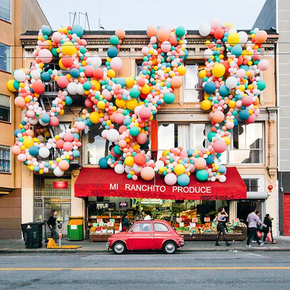
Balloons Anyone?
Imagine you run a small fresh market grocery store and you’re looking to compete with the local big chain. You may not have to produce that they have for the prices they can offer, but what you do have is a high volume of balloons surrounding your storefront sign. Imagine seeing this walking down the street? It would be almost impossible not to stop, say hello and maybe buy a few things.
Colours
Look at the unique way this sign uses colours. It’s absolutely breathtaking and it definitely catches the eyes. This could be a great way to put aside together for a restaurant or a nightclub, but the fact you can’t tell what this is for means it’s both elegant and exciting. A great way to brand something upscale and cool.

A Yellow Loft
Look at the way this sign is integrated into the side of a wall. The wall has such a cool design it’s impossible not to look at this. Definitely edgy, cool, and the yellow colour stands out.

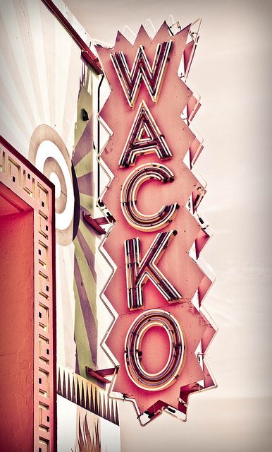
A Wacky Sign
This sign absolutely screams a good time. It would definitely stand out on a busy street where all the action is. This one’s impossible to miss.
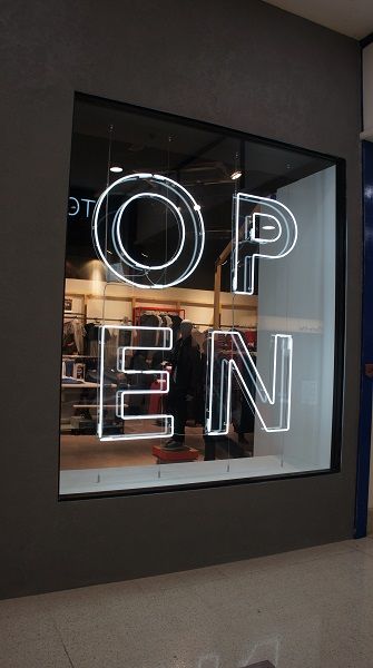
We’re Open
Remember how we touched on fluorescent lighting. This sign is fluorescent but it’s a cool spin on the boring old “Come in, we’re open” sign.
W is for Hotel
The W Hotel is owned by Marriott International. They’ve got locations all over North America and wherever you go and the W exists, you know exactly what it is. One of the simplest but more powerful examples of branding done right.

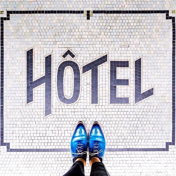
Speaking of Hotels
Here’s a sign on the floor that’s perfect for when customers are already sold enough to walk in. Notice the borders and the simple typeface? These two elements work really well with this sign. Definitely a memorable look and you know people always look down at the floor when they walk through a door.
Waffles for Breakfast?
This is probably the coolest sign for a diner or breakfast place that we have ever seen. The font works really well and the sign itself is a waffle. It doesn’t get any better than that.

ABC and XYZ
Imagine you’re walking down the street and you see the sign for a bar and café. It would instantly catch your eyes because of the contrast. The design is simple and inviting.
There you have it! All these tips and examples of signs that your disposal. Now it’s time to get out there and top the competition, but don’t use too many words and make sure you stay on brand. Remember you may only get people looking once and they may never look back. Be bold and be memorable with your signage.


Jack has been in the internet marketing space for 10 years. He enjoys writing and watching the Toronto Raptors.